1. Grid and table elements in PDF
If you were to generate reports or similar documents, containing extensive amounts of ordered data, you would probably think whether there is a default, PDF - specific way to do it. We should disappoint you and assert that there’s no such way and PDF specification simply allows us to put drawing commands on PDF page, encouraging to generate the desired representation ourselves.
It should be noted, however, that PDF outlines the special markup technique named “Marked content” that you can use to define the nature of the graphical objects sets put on page. It could help you to identify these objects later and provide some application-specific viewing or processing logic. See section 14.6. Marked Content in PDF specification for details. But you still have to generate the content yourself, marked or not.
Manual generation of grids and tables can appear as a boring task one could rather prefer to be automated. As a part of this article, we’ll dive into details of automatic grid creation and generation and show how to create perfect tables and grids using a few small pieces of C# code and Apitron PDF Kit for .NET component as the main tool.
2. Grid element in flow layout model
The grid element in flow layout model is represented by the Gridclass and helps to automate the creation of tabulated data in PDF. Its rows are represented by the GridRow objects and cells can be of any supported content element type, mostly TextBlocks. To place more than one content element into grid cell, you’d have to use one of the available container objects e.g. Section. When content element object is being added into a grid row to represent a cell, one important modification to its style is being made – it becomes a block element. Even if its Display property had the value different from Blockbefore this addition, it would be set to Blockand content element would be treated as a grid cell. This modification also assumes that when the column and row sizes are set explicitly, the element representing the cell will be sized accordingly.
The grid element supports automatic splitting and can produce multiple pages if needed. Read more about grids and flow layout model in our book Apitron PDF Kit in action.
2.1 Grid borders and paddings
As any other content elements, grids can have standard outer borders and paddings set. In addition, InnerBorder and CellPadding properties can be used to define one of the main grid's appearance characteristics: thickness and color of lines separating the cells, and inner cell padding.
2.2 Simple grid with uniform cells
Let’s create the document containing a simple grid with uniform cells, using the code below:
/// Creates simple grid with default inner border.
///</summary>
publicvoid CreateSimpleGrid()
{
// create resource manager and document object
ResourceManager resourceManager = newResourceManager();
FlowDocument doc = newFlowDocument(){Margin = newThickness(5)};
// create grid with 4 autosized columns taking 50% of the available space
Grid grid = newGrid(Length.Auto,Length.Auto,Length.Auto,Length.Auto);
grid.Width = Length.FromPercentage(50);
// add 2 grid rows with data
grid.Add(newGridRow(newTextBlock("Order"), newTextBlock("Date"),
newTextBlock("Customer"), newTextBlock("Paid")));
grid.Add(newGridRow(newTextBlock("1184A"), newTextBlock("01/02/2015"),
newTextBlock("Jon Doe"), newTextBlock("No")));
// add grid to document
doc.Add(grid);
// save document
using (Stream stream = File.Create("simple_grid.pdf"))
{
doc.Write(stream, resourceManager);
}
}
The result looks as follows:
Pic. 1 Simple grid with uniform cells |
Created grid has uniform cells and takes 50% of the available page space; it has single inner border and two data rows (including header).
2.3 Simple grid with col spans and row spans
If the “customer” from previous example had more than one order, we could group them all using a row span. To show a col span, we will add a table header spanning across the table.
See the code:
publicvoid CreateSimpleGridWithSpans()
{
// create resource manager and document object
ResourceManager resourceManager = newResourceManager();
FlowDocument doc = newFlowDocument(){Margin = newThickness(5)};
// create grid with 4 autosized columns taking 50% of the available space
Grid grid = newGrid(Length.Auto,Length.Auto,Length.Auto,Length.Auto);
grid.Width = Length.FromPercentage(50);
// add header row spanned across the grid
grid.Add(newGridRow(newTextBlock("Orders and payments") { ColSpan = 4,
Align = Align.Center }));
// add col headers
grid.Add(newGridRow(newTextBlock("Order"), newTextBlock("Date"),
newTextBlock("Customer"), newTextBlock("Paid")));
// add data row with 3d column spanned across 3 rows below
grid.Add(newGridRow(newTextBlock("1184A"), newTextBlock("01/02/2015"),
newTextBlock("Jon Doe"){RowSpan = 3}, newTextBlock("No")));
newTextBlock("No")));
grid.Add(newGridRow(newTextBlock("1184C"), newTextBlock("05/02/2015"),
newTextBlock("No")));
// add grid to document
doc.Add(grid);
// save document
using (Stream stream = File.Create("simple_grid_with_spans.pdf"))
{
doc.Write(stream, resourceManager);
}
}
And resulting image:
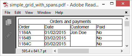 |
Pic. 2 Simple grid with col spans and row spans |
Notice the last two rows having they columns shifted to the right because of the row span in the middle of the row above them.
2.4 Simple grid with composite cells
If you were to put several content elements in one cell, you would have to use a container element. Suitable existing containers are Sectionand Grid itself. Let’s add image and text into the single cell. The code:
publicvoid CreateSimpleGridWithCompositeCells()
{
// create resource manager and register images
ResourceManager resourceManager = newResourceManager();
resourceManager.RegisterResource(
new Apitron.PDF.Kit.FixedLayout.Resources.XObjects.Image("flag_red",
"flag_red.png"));
resourceManager.RegisterResource(
newApitron.PDF.Kit.FixedLayout.Resources.XObjects.Image("flag_green",
"flag_green.png"));
FlowDocument doc = newFlowDocument(){Margin = newThickness(5)};
// create grid with 4 autosized columns taking 50% of the available space
Grid grid = newGrid(Length.Auto,Length.Auto,Length.Auto,Length.Auto);
grid.Width = Length.FromPercentage(50);
// add col headers
grid.Add(newGridRow(newTextBlock("Order"), newTextBlock("Date"),
newTextBlock("Customer"), newTextBlock("Paid")));
// create section for status cell
Section paymentStatusNo = newSection(
new Apitron.PDF.Kit.FlowLayout.Content.Image("flag_red"),
newTextBlock("No") );
grid.Add(newGridRow(newTextBlock("1184A"), newTextBlock("01/02/2015"),
newTextBlock("Jon Doe"),
paymentStatusNo));
Section paymentStatusYes = newSection(
new Apitron.PDF.Kit.FlowLayout.Content.Image("flag_green"),
newTextBlock("Yes") );
grid.Add(newGridRow(newTextBlock("1184B"), newTextBlock("03/02/2015"),
newTextBlock("Jon Doe"), paymentStatusYes));
doc.Add(grid);
// save document
using (Stream stream = File.Create("simple_grid_with_composite_cells.pdf"))
{
doc.Write(stream, resourceManager);
}
}
Resulting image:
 |
Pic. 3 Simple grid with composite cells |
2.5 Multipage grid
What if you data records take more than one page and have to be paginated? Grid element will handle it automatically unless it’s explicitly sized. Sample below shows what happens if we rely on this behavior and add more records than a page can fit.
Code sample:
/// Creates multipage grid.
///</summary>
publicvoid CreateMultipageGrid()
{
// create resource manager and document object
ResourceManager resourceManager = newResourceManager();
FlowDocument doc = newFlowDocument() { Margin = newThickness(5) };
// create grid with 4 autosized columns taking 100% of the available space
Grid grid = newGrid(Length.Auto, Length.Auto, Length.Auto, Length.Auto);
// add col headers
grid.Add(newGridRow(newTextBlock("Order"), newTextBlock("Date"),
newTextBlock("Customer"),
newTextBlock("Paid")));
// add data records
for (int rowIndex = 0; rowIndex < 45; rowIndex++)
{
grid.Add(newGridRow(newTextBlock(rowIndex.ToString()), newTextBlock("01/02/2015"),
newTextBlock("Jon Doe"), newTextBlock("Yes")));
}
// add grid to document
doc.Add(grid);
// save document
using (Stream stream = File.Create("multipage_grid.pdf"))
{
doc.Write(stream, resourceManager, newPageBoundary(Boundaries.A6));
}
}
This code creates a grid split on two parts because it simply doesn’t fit on one page. If we add more records or change output page boundary, the number of generated pages will change accordingly. Notice that you don’t have to do anything special for this pagination effect to happen, it’s fully auto. If you set the grid height explicitly, you will limit the number of visible rows (if their accumulated height exceeds the specified grid height).
The image below shows the resulting PDF document containing multipage grid.
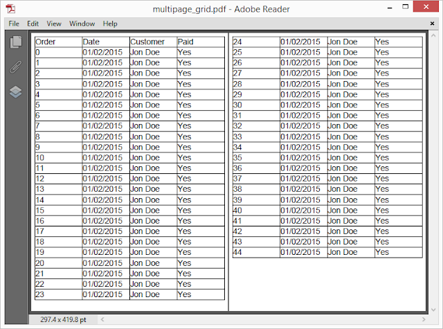 |
Pic. 4 Multipage grid |
We have created only two pages here, but the idea is clear. Whenever you need a multipage grid in PDF, this flow layout code will do the job.
3. Grid rows and cells styling
Flow layout API offers rich styling capabilities in a form of inline or selector-based styles. It is possible to style individual cell elements as well as grid rows with minimum efforts, and create PDF documents with highly customized data grids within minutes.
3.1 Vertical and horizontal content alignment
The most often needed operation is positioning of the content within cell’s boundaries. There are two properties designed for that, named Alignand VerticalAlign respectively.
Align property, affects only Blockor InlineBlock elements, just like its analog in HTML. Because table cells are being implicitly treated as block elements, it’s possible to align their content using Align property exposed by each ContentElementdescendant. This setting can be inherited by inner block elements, making it possible to set the horizontal alignment for the entire row by setting it for the GridRow container object instead of individual cell elements.
VerticalAlign property, can be used to define positioning of inline elements within a line of content inside the parent, and is, therefore, dependent on the line height of the parent element. To vertically align an element, one would need to place it inside the Section or similar container, and then set element’s VerticalAlignproperty to the desired value.
In general, to align a piece of content vertically inside the grid cell, you would have to:
- create a Section representing a cell, add it into GridRow
- set its LineHeight to be equal to the height of the parent row
- add the element to this section, and set its VerticalAlign to the desired value
Otherwise, if you had to vertically align single line text block inside the grid row, you could just set its LineHeight equal to the parent row height without the use of the intermediate section.
Let’s see the sample code showing how to create a grid with variously aligned cells content:
///<summary>
/// Creates a grid with aligned content.
///</summary>
publicvoid CreateGridWithAlignedContent()
{
// create resource manager and document object
ResourceManager resourceManager = newResourceManager();
FlowDocument doc = newFlowDocument() { Margin = newThickness(5) };
// create border styles for textblocks and sections
doc.StyleManager.RegisterStyle("TextBlock",
newStyle(){Border = newBorder(1), BorderColor = RgbColors.Red});
doc.StyleManager.RegisterStyle("Section",
newStyle(){Border = newBorder(1), BorderColor = RgbColors.Green});
// create grid with 4 autosized columns taking 100% of the available space
Grid grid = newGrid(Length.Auto, Length.Auto, Length.Auto, Length.Auto);
// add header row
GridRow header = newGridRow(newTextBlock("Order"), newTextBlock("Date"),
newTextBlock("Customer"), newTextBlock("Paid"));
// set text alignment, all cells will inherit this setting
header.Align = Align.Center;
header.Height = 30;
grid.Add(header);
// add content row
GridRow contentRow = newGridRow(newSection(newTextBlock("1237AS")
{ VerticalAlign = VerticalAlign.Bottom,LineHeight = Length.FromPercentage(110)})
{ Align = Align.Left, LineHeight = 48 },
newSection(newTextBlock("01/02/2015")
{ VerticalAlign = VerticalAlign.Top,LineHeight = Length.FromPercentage(110)})
{ Align = Align.Right, LineHeight = 48 },
newTextBlock("Jon Doe"){LineHeight = 48},
newTextBlock("Yes") {Align = Align.Center});
contentRow.Height = 50;
grid.Add(contentRow);
// add grid to document
doc.Add(grid);
// save document
using (Stream stream = File.Create("grid_content_alignment.pdf"))
{
doc.Write(stream, resourceManager, newPageBoundary(Boundaries.A6));
}
}
Take a look at the image representing the results created by the piece of code above:
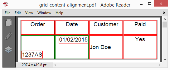 |
Pic. 5 Cell's content alignment |
Sections and TextBlocks have color borders around them to make their boundaries visible, and provide visual markers for further analysis. See the annotated image below, it highlights the key elements and explains the structure of the grid shown above.
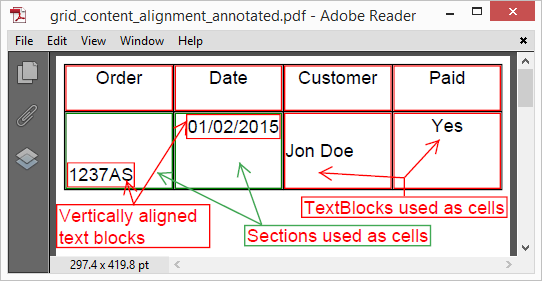 |
Pic. 6 Cells' content alignment annotated |
All content elements have borders added using matching styles. See that vertically aligned text blocks are positioned within sections added as cells and with their LineHeight set to row height. TextBlocks, used as cells, align their content differently. The one, containing “John Doe”, has its LineHeight set to row height; the others have default line heights (based on font height), and their content is vertically aligned within the lines defined by these values.
3.2 Highlighting a row with a background color
Highlighting a row with some color is as simple as setting its background color. Another way for achieving the same result is to set background color for all elements in the row. Whichever way you choose, you can either set the Backgroundproperty of the element explicitly, or use a style object matching one or more elements if needed.
Let’s take the code from multipage grid sample and slightly modify it, turning our grid to zebra:
///<summary>
/// Creates a grid with even rows highlighted.
///</summary>
publicstaticvoid CreateZebraGrid()
{
// create resource manager and document object
ResourceManager resourceManager = newResourceManager();
FlowDocument doc = newFlowDocument() { Margin = newThickness(5) };
// register style for even rows using class selector
doc.StyleManager.RegisterStyle("gridrow.gray", newStyle(){
Background = RgbColors.LightGray});
// create grid with 4 autosized columns taking 100% of the available space
Grid grid = newGrid(Length.Auto, Length.Auto, Length.Auto, Length.Auto);
// add col headers
grid.Add(newGridRow(newTextBlock("Order"), newTextBlock("Date"),
newTextBlock("Customer"),
newTextBlock("Paid")));
// add data records
for (int rowIndex = 0; rowIndex < 45; rowIndex++)
{
GridRow dataRow = newGridRow(newTextBlock(rowIndex.ToString()),
newTextBlock("01/02/2015"),
newTextBlock("Jon Doe"),newTextBlock("Yes"));
if ((rowIndex & 0x1) == 0)
{
dataRow.Class = "gray";
}
grid.Add(dataRow);
}
// add grid to document
doc.Add(grid);
// save document
using (Stream stream = File.Create("zebra_grid.pdf"))
{
doc.Write(stream, resourceManager, newPageBoundary(Boundaries.A6));
}
}
Resulting grid is shown on the image below:
 |
Pic. 7 Grid with even rows highlighted |
Note that we have added only a simple style based on a class selector matching rows with class “gray”, and assigned this class to each even GridRowof the grid. Not much code really, but the final grid changes nicely. It’s possible to define other styles, e.g. for odd rows, every 3rd row and so on. All you need is a right style.
3.3 Cell styling
When it comes to cell styling, the whole arsenal of content element properties is at your disposal. As usual in flow layout, elements inside the grid row can be styled using their exposed properties or matching styles. Let’s create a styled version of the very simple grid from section 2.1 Grid borders and paddings. See the code:
// Creates simple grid with styled cells.
publicvoid CreateGridWithStyledCells()
{
// create resource manager and document object
ResourceManager resourceManager = newResourceManager();
FlowDocument doc = newFlowDocument() { Margin = newThickness(5) };
// register styles:
// style for all grid rows, sets horizontal content alignment
doc.StyleManager.RegisterStyle("GridRow", newStyle() {Align = Align.Center});
// style for all child text blocks of the element with class "header",
// we use it for grid header
doc.StyleManager.RegisterStyle(".header > TextBlock",
newStyle(){
Font = new Apitron.PDF.Kit.Styles.Text.Font(StandardFonts.HelveticaBold, 14),
Color = RgbColors.White,
Background = RgbColors.Gray,
});
// styles for textblock elements having classes "no" and "yes" respectively
doc.StyleManager.RegisterStyle("TextBlock.no",
newStyle(){Background = RgbColors.Red, Color = RgbColors.White});
doc.StyleManager.RegisterStyle("TextBlock.yes",
newStyle(){Background = RgbColors.Green, Color = RgbColors.White});
// create grid with 4 autosized columns taking 100% of the available space
Grid grid = newGrid(Length.Auto, Length.Auto, Length.Auto, Length.Auto);
// create round border
grid.BorderRadius = 5;
// add header
GridRow header = newGridRow(newTextBlock("Order"), newTextBlock("Date"),
newTextBlock("Customer"), newTextBlock("Paid"));
header.Class = "header";
grid.Add(header);
// add data rows
grid.Add(newGridRow(newTextBlock("1184A"), newTextBlock("01/02/2015"),
newTextBlock("Jon Doe"),
newTextBlock("No"){Class = "no"}));
grid.Add(newGridRow(newTextBlock("1184B"), newTextBlock("01/02/2015"),
newTextBlock("Jon Doe"),
newTextBlock("Yes"){Class = "yes"}));
// add grid to document
doc.Add(grid);
// save document
using (Stream stream = File.Create("styled_cells.pdf"))
{
doc.Write(stream, resourceManager, newPageBoundary(Boundaries.A6));
}
}
This code creates a grid with a colored header and two rows. Each of the data rows has its last cell styled according to the state of the payment using one of the defined styles. So, the non-paid one becomes red, and the paid one turns green. In addition, the grid has a round-rect border which, indeed, adds some coolness.
See the image below:
See the image below:
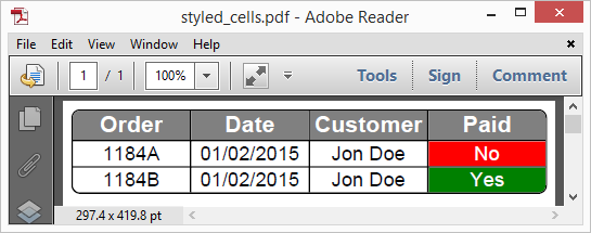 |
Pic. 8 Grid cells styling |
Styling cells using build-in styling mechanism offers unlimited flexibility and provides an easy and convenient way to achieve complex visual effects in your grids. You can style any element in any cell as you want, and it’s incredibly useful for data visualization.
We demonstrated how to use Apitron PDF Kit to create PDF documents containing complex tabular data structures such as grids. This .NET PDF component is available for many existing platforms and can be used in desktop, mobile, web, and cloud applications and services. We’d like to hear your feedback and see your comments regarding the library and API it offers. Contact our support or ask us here and we’ll be happy to answer your questions.
4. Conclusion
We demonstrated how to use Apitron PDF Kit to create PDF documents containing complex tabular data structures such as grids. This .NET PDF component is available for many existing platforms and can be used in desktop, mobile, web, and cloud applications and services. We’d like to hear your feedback and see your comments regarding the library and API it offers. Contact our support or ask us here and we’ll be happy to answer your questions.